This project was part of the subject Visual Design during my study. For eight weeks, I worked on a visualization of the atmosphere of a movie by only using its title in black and white. In the process I learned how to convey a certain atmosphere through typography and motion.
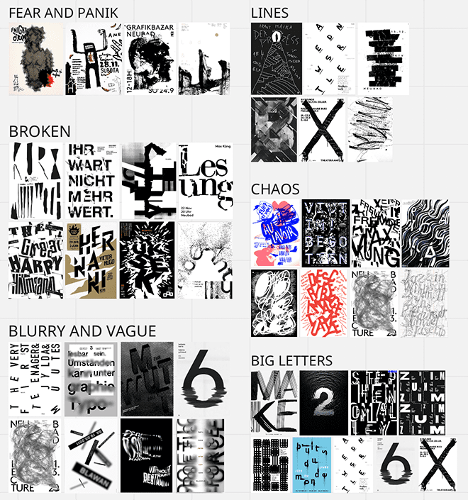
After watching the movie and looking closely at some scenes, I was able to perceive the atmosphere of the movie and started doing visual research about it. I practiced to trust in my intuition and collected a bunch of typographic posters as inspiration.
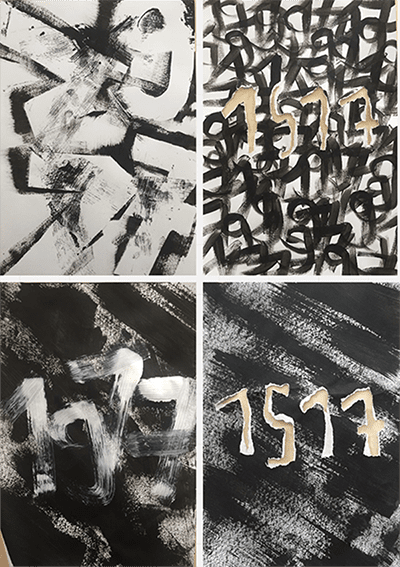
After lots of experiments and feedback rounds, I started working with the movie title. As the movie I chose is called "1917", I only had four letters to design. I got into a great flow of experimenting with paint, ripped paper and different brushes to communicate the atmosphere of the movie.
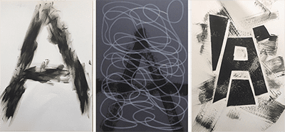
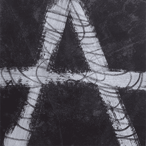
The next step was to translate the findings of the visual research into my own creations. I was asked to create the letter "A" only in black and white as a representation of the movie's main character. I knew I wanted to work analogue with paint and brush, as this fits much better to the movie's atmosphere.
The last challenge during this project was to add motion to the static posters. I combined the painted numbers with effects and motion in After Effects. It was the first time I worked with motion, but definitely not the last one.